Project Overview:
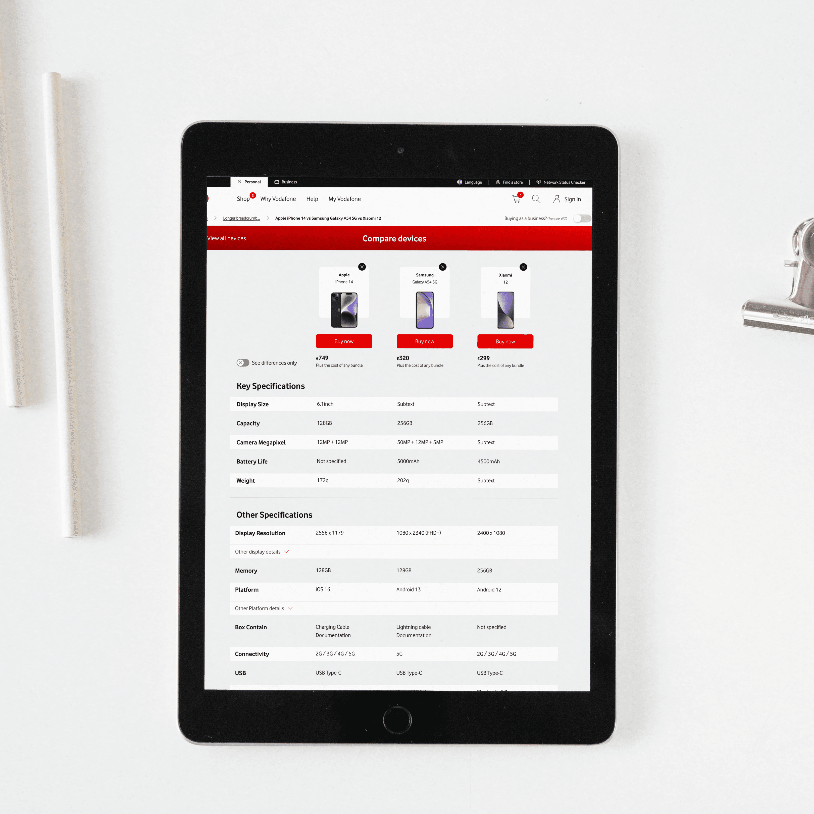
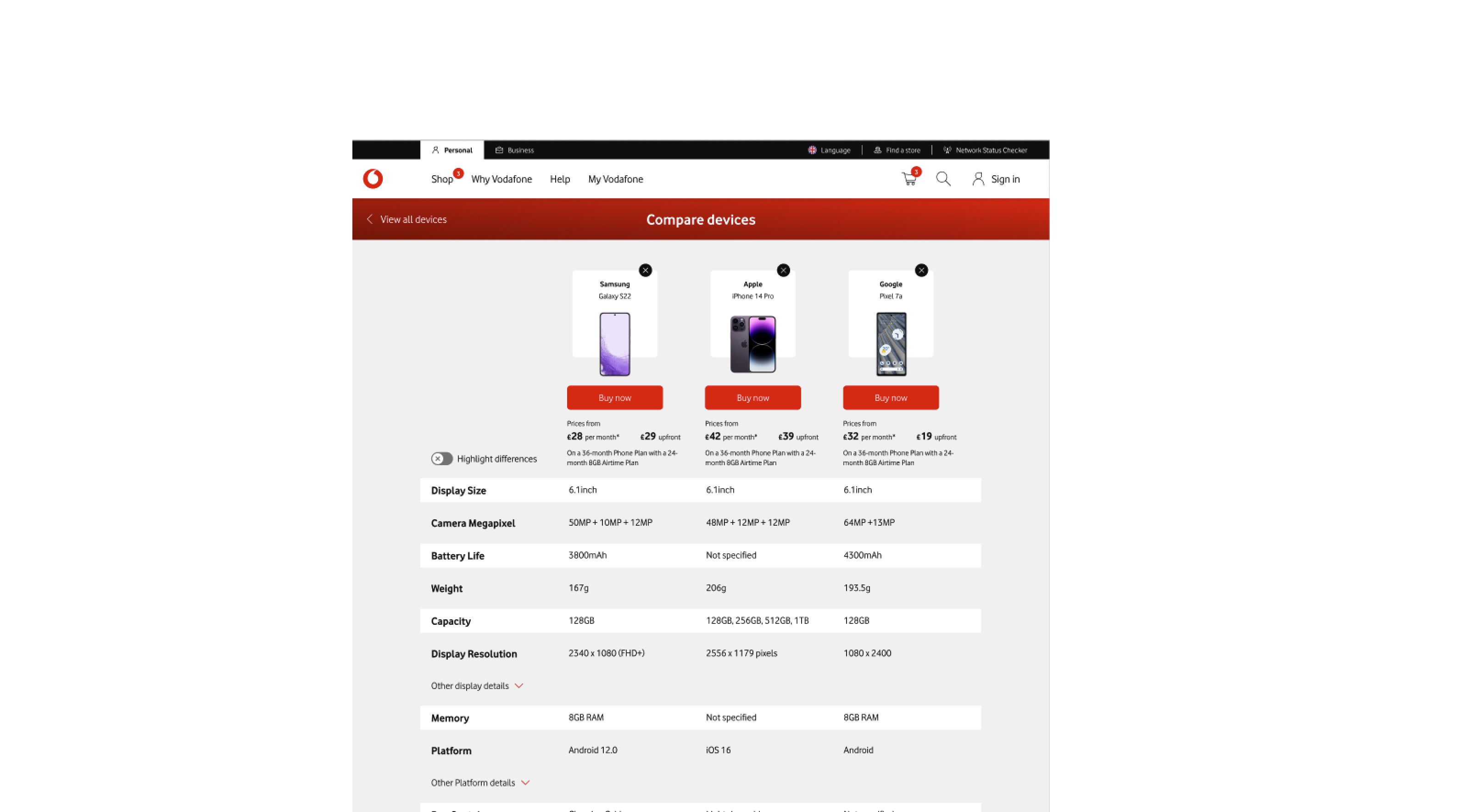
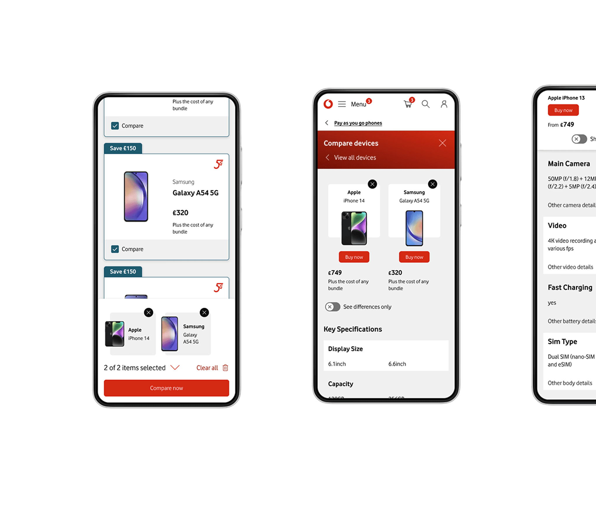
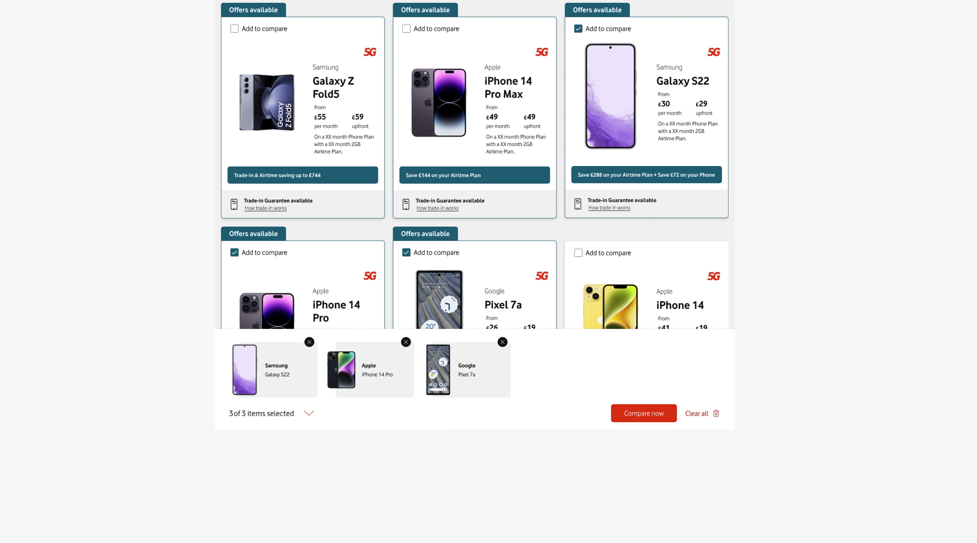
As the lead UX designer, I led the design for a comparison tool for Vodafone UK's PAYG (Pay-As-You-Go) handset journey. The tool addressed users' challenges in comparing devices, enabling them to make informed purchase decisions by presenting specifications side-by-side in an intuitive interface. The process was research-driven, starting with user testing on a Figma prototype to gather valuable insights. These insights informed design adjustments before implementing the tool for A/B testing.
Background:
Vodafone UK, a leading telecommunications provider, serves a broad user base in its PAYG handset journey, where affordability and flexibility are key considerations. Research revealed a significant gap: users often turned to third-party sources to compare devices, as Vodafone's platform lacked a comparison feature.
This project aimed to bridge that gap by creating a user-friendly comparison tool, improving the customer experience while driving business objectives, such as increased conversion rates (CVR) and add-to-basket (ATB) metrics.
Research and Testing:
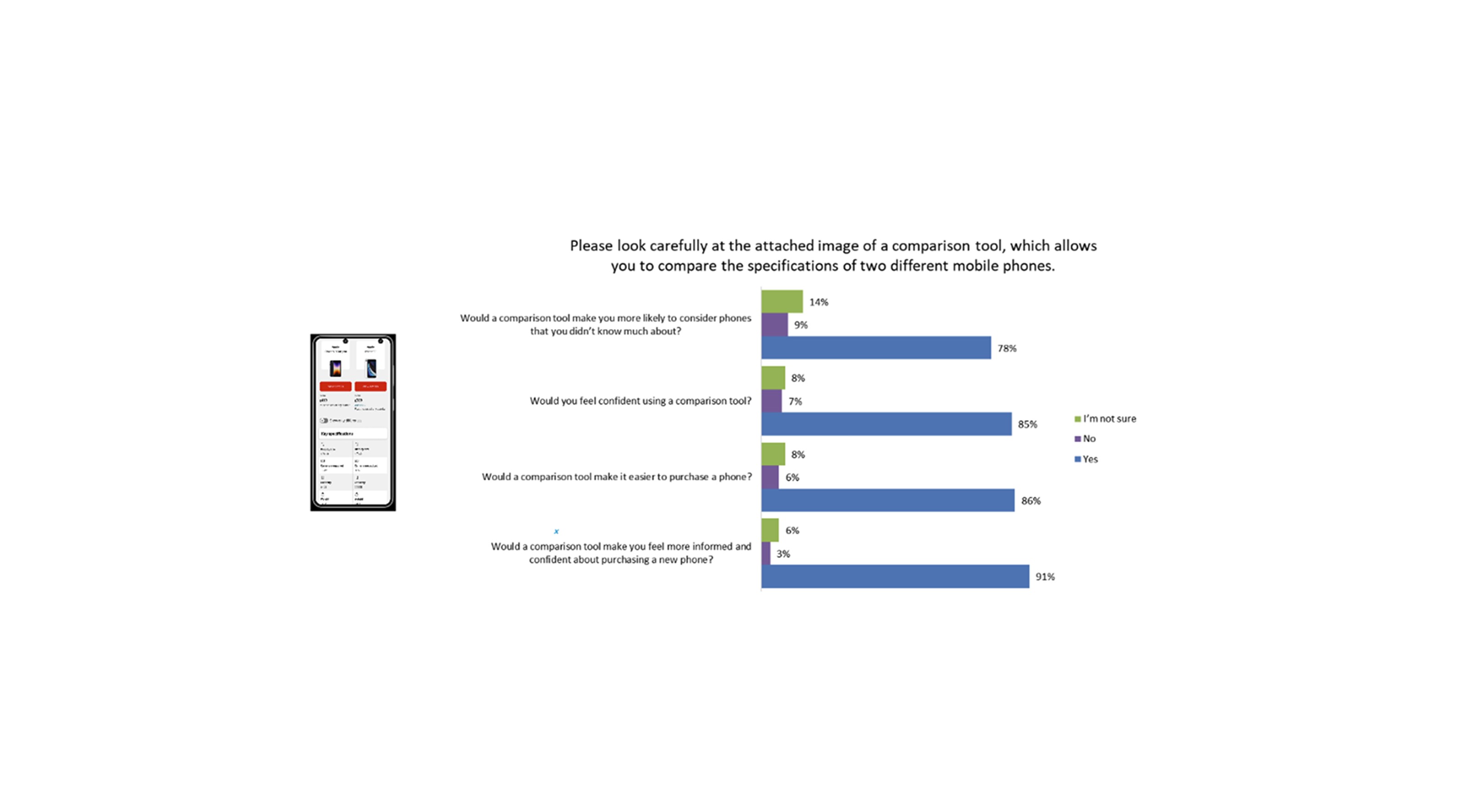
The design process began with unmoderated user testing of a Figma prototype, involving 24 participants across desktop and mobile platforms. Key insights included:
Ease of Use: Users found the prototype intuitive, with low mental effort required to complete comparisons.
Feature Expectations: Participants valued the ability to compare key specs like price, camera quality, and battery life but requested more contextual explanations for technical features (e.g., camera benchmarks).
Visibility Challenges: Features like the "show differences" toggle and "skip to section" dropdown were underutilized due to poor visibility.
These insights guided key design adjustments:
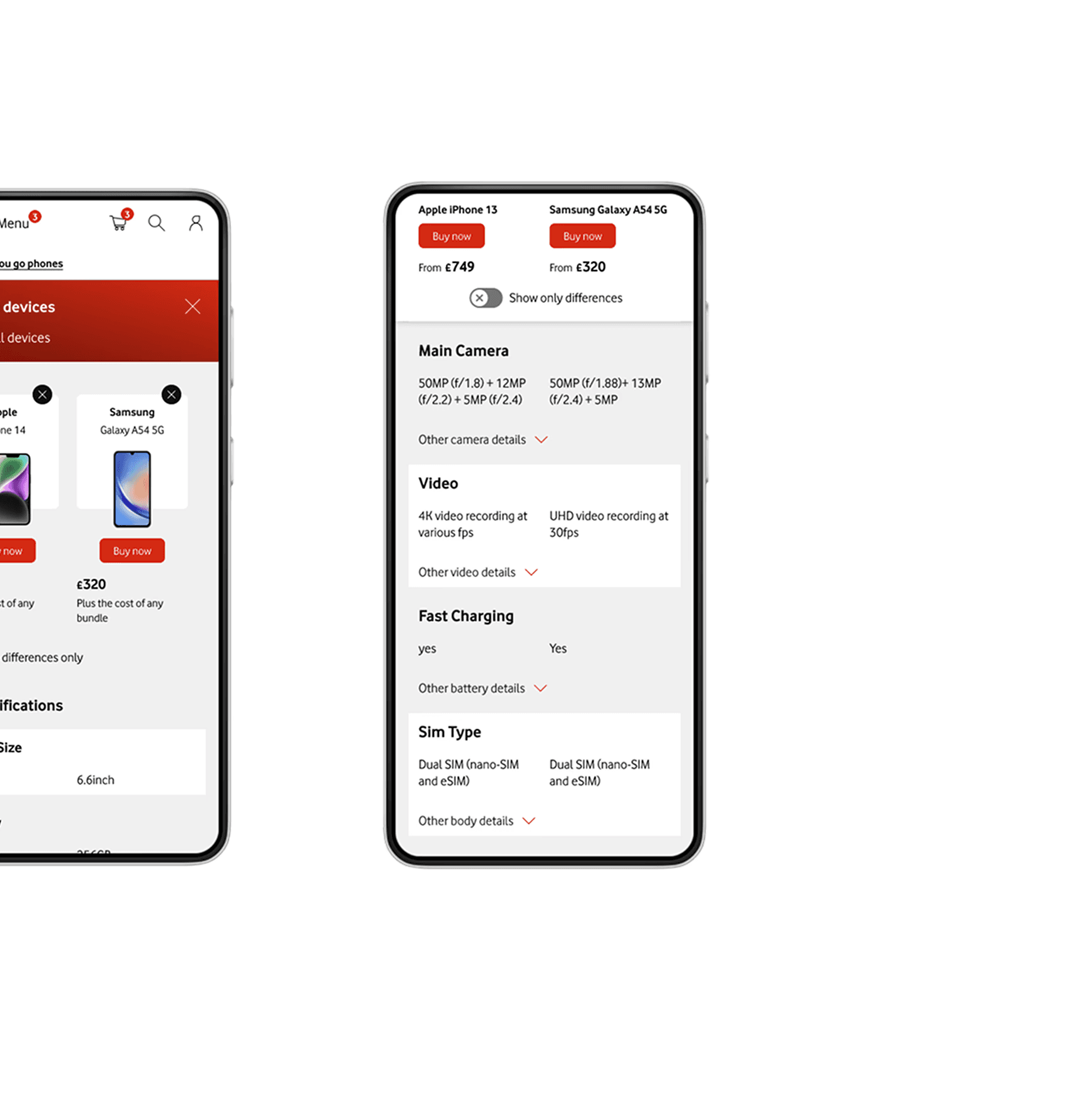
Increasing the prominence of the "show differences" toggle.
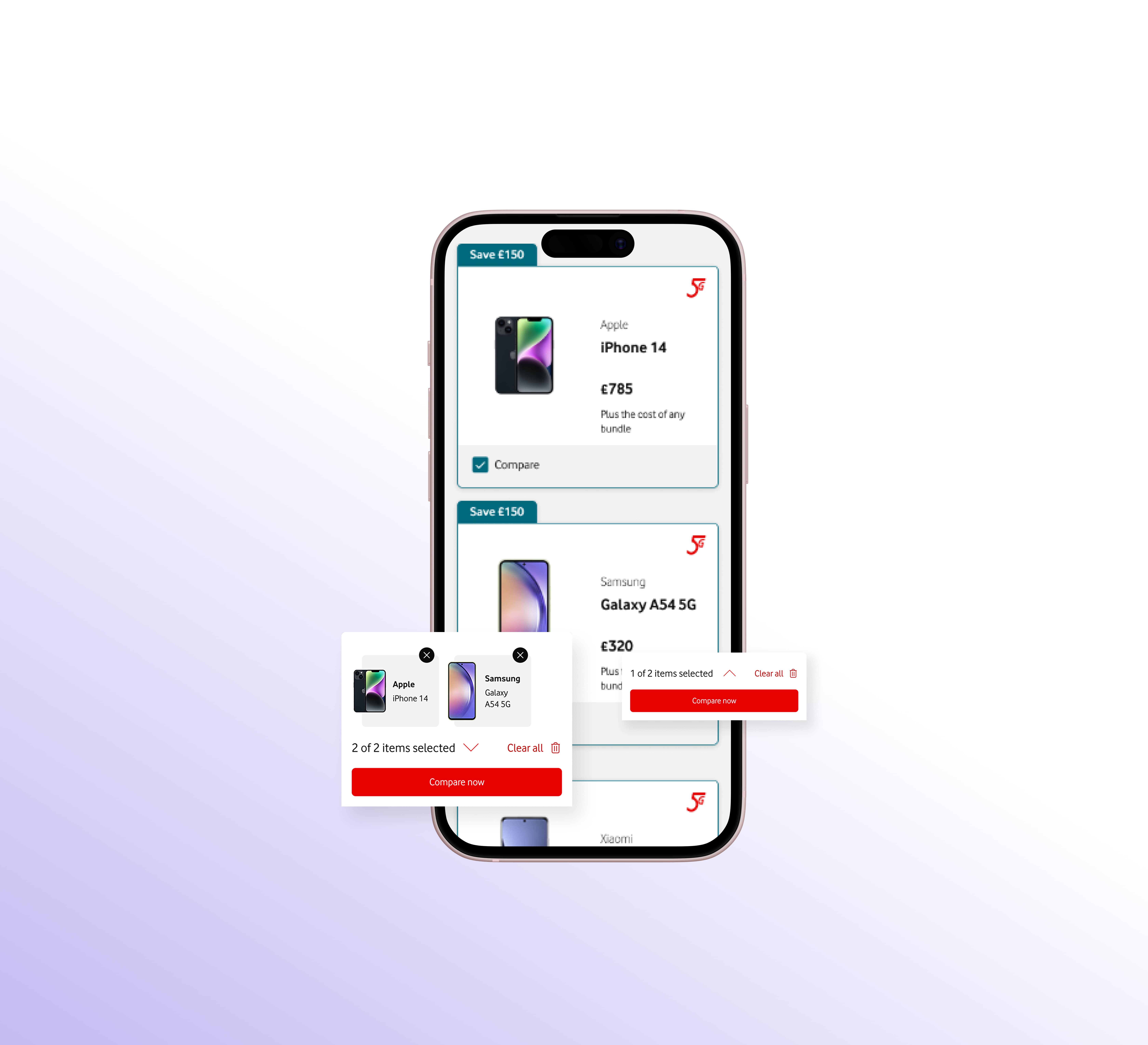
Reducing the sticky banner size for smaller screens and incorporating pricing details.
Enhancing tooltips and icons for better understanding of technical specs.
Once these refinements were made, the updated designs were implemented and tested through A/B testing.
Challenges and UX Solutions:
Complex Specifications:
Users struggled with technical jargon, so I added simplified language, icons, and tooltips to make the comparison table more user-friendly.
Visual Overload:
Initial designs of the sticky banner consumed excessive screen space on smaller devices. I refined the layout to make it collapsible and responsive while retaining key information like pricing.
Dead-End Navigation:
The original design lacked clear next steps. I added CTAs linking to product detail pages (PDPs) and reviews, improving the overall user journey.
Outcome and Results:
The comparison tool launched as part of a live test, yielding the following results:
+2.78% increase in ATB (Add-to-Basket) rates.
4x higher CVR for users engaging with the comparison tool compared to average PAYG users.
Improved user satisfaction due to simplified comparisons and intuitive navigation.
Despite the positive impact on engaged users, overall usage of the tool remained low at 0.98% of total visitors. This highlighted the need for further efforts to improve discoverability and engagement.
Next Steps:
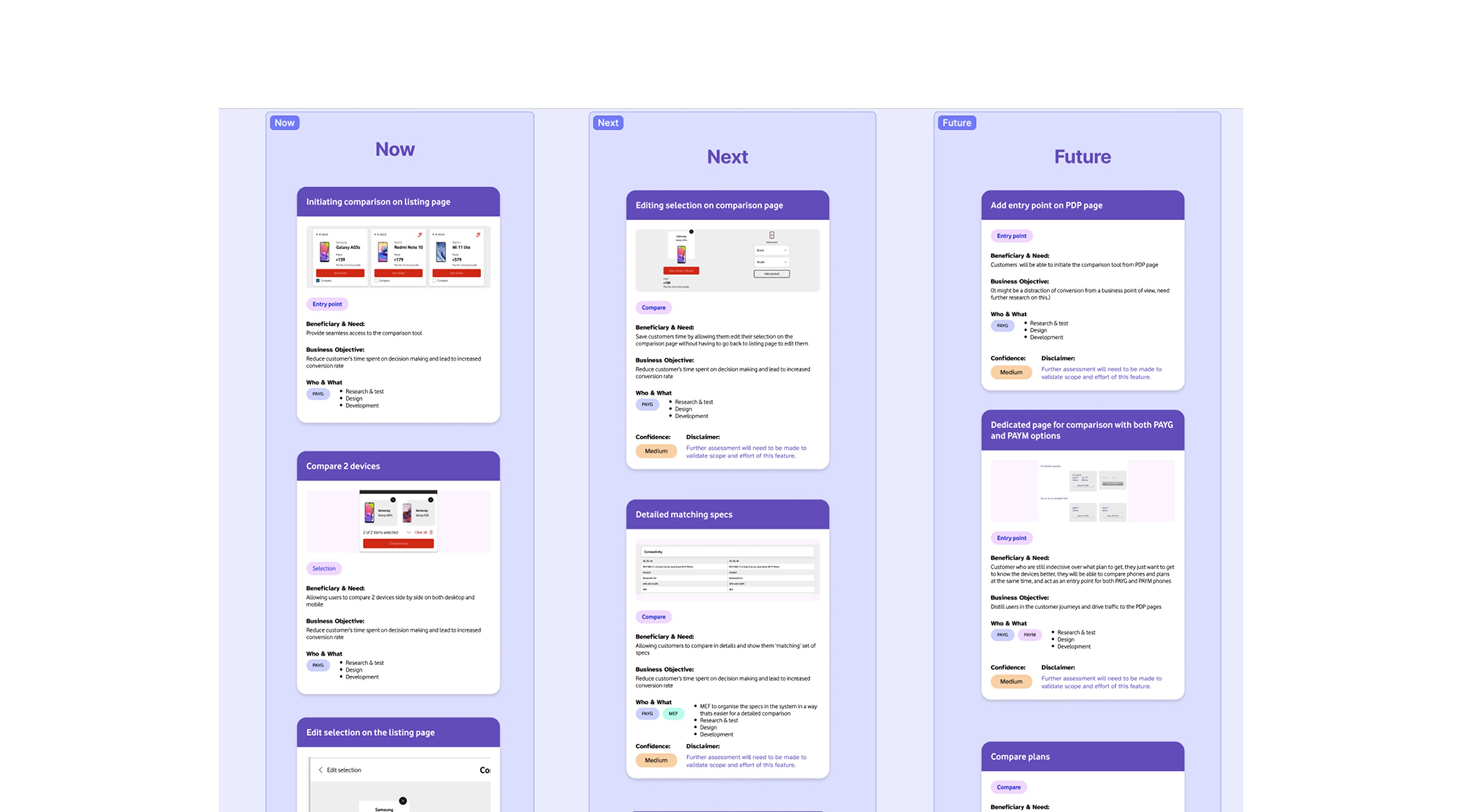
Based on the results and discussions with the development team, I assessed the necessary changes and optimizations for the tool. From this, I created a UX feature roadmap, outlining:
MVP Features (Now) – A clear list of features already implemented in the initial release.
Fast-Follow Improvements (Next)– High-impact optimizations that could be quickly introduced to enhance usability and performance.
Future Enhancements (Future)– Larger, more complex features requiring additional effort but essential for long-term scalability and refinement.
This roadmap ensured a structured, iterative approach to improving the tool, balancing quick wins with long-term innovation, while keeping stakeholders aligned on priorities and development feasibility.
Conclusion:
This project was a great opportunity to grow as a lead UX designer. Testing the prototype with real users highlighted the importance of addressing genuine user needs early on, and iterating on their feedback helped refine the solution. Balancing user experience with business goals and collaborating across teams made this a rewarding challenge. It was incredibly rewarding to see how thoughtful, user-centered design could make such a tangible impact.